Summer Gallery Visits
Tate Modern
In preparation for my A-Level studies in photography I visited Tate Modern at Bankside in London. There were numerous exhibitions I could visit at the time and particularly liked a piece of work by Peter Sedgley called "Colour Cycle III" made in 1970. I chose it because I like the idea and use of constantly changing colours as well as it being composed of concentric circles.
The main focus is the small, bold circle in the centre. At first some of the colours contrast but then they gradually become more blended and smooth as the light pattern changes giving it a disorientating feeling. The edges of each circle are blurred where the colours mix.
The use of colours and contrast can be used as inspiration in my future works.


The National Gallery

I also visited The National Gallery at Trafalgar Square over my summer. Of the many paintings I saw I liked JMW Turners "The Fighting Temeraire". It shows the ship Temeraire being towed to be scrapped. It is a contrast between the old fashioned sailing ships and the newly steam powered boats. It is the old being replaced by the new.
I chose this because I liked the use of the sunset and the reflections in the sea. I wanted to find the meaning behind this painting and this interested me to look into it.
Tate Britain

The final gallery I visited was Tate Britain where I saw an exhibition called "The Squash" by Anthea Hamilton. This consists of a solo performer dressed up as a squash that interacts with multiple sculptures around the gallery. I chose this because I thought it was very odd and unique. It is completely different to everything else in the gallery and it also different every day due to the fact that there are 7 different costumes. The idea was inspired by a photograph she found in a book whilst researching. The photograph showed a person dressed as a squash and used this for her idea. The gallery has been tiled with white tiles on the floor and has numerous tiled podiums for the squash to interact with.
This visit taught me that there are no limits to art and it can be interpreted in many different ways. At first I wasn't sure what it was and this interested me.
Summer Photos


These photographs were selected as the best that were taken over the summer holiday. They are all quite varied without a common theme but some of them can be linked together.
I have attempted to show my eye for detail and this is greatly by the quality of the natural light and in many cases the casting of strong shadows to provide depth. Shadows are very prominent in the photograph of window shutters with strong horizontal aspects and bright primary colours creating contrast. They successfully reflect my holiday as a combination of touristy beach scenes and the more quiet cultural aspect of the island of Mallorca in Spain. Some are of an architectural nature and pick up on the rhythm of a street scene with curved street lights lining the side and strong shadows cast over windows for an over hanging tiled feature.
There are contrasts in the composition between the straight horizontal line of the horizon of the sea and cascading rocks to the foreground in the two seascapes.
I have tried to use objects to frame other objects in the sculpture around the fountain and tree branches to the top of one of the beach scenes. Reflections feature strongly in the two photographs of the cathedral utilising the lake to the front and the strong feature of the arched bridge. Some of the photographs are of a building by the Architect Antonio Gaudi and these are extremely rich in detail, colour and shadow creating very strong contrasts. I have used a window in the door to create a frame for an outside view of the garden and swimming pool. The sun back lighting palm trees have been used for good effect. The picture has been composed by positioning myself so the sun is directly behind the top of the palm tree creating a very bright centre to the composition. I am proud if several if the photographs particularly the ones containing reflections in the lake almost creating a second symmetrical image.
Lee Bul
Lee Bul was Born in South Korea in 1964. She is a contemporary sculpturer and instillation artist. She gained fame and notoriety in the late 1980s for expressing feminist views in the ideological world of art. Her works of art are often cold, technical and mechanical that reflect the ideas of society in the future. She graduated at Hongik University in Seoul in 1987 and her works of art exhibited around the world have often been seen as controversial.
Lee Bul is a contemporary sculpturer and instillation artist. She often uses solid, cold, mechanical and metallic objects to create her instillations. Her works are all 3-Dimensional and are exhibited internally. They rely on the observer almost entering the work to view it.
Lee Bul is a contemporary sculpturer and instillation artist. She often uses solid, cold, mechanical and metallic objects to create her instillations. Her works are all 3-Dimensional and are exhibited internally. They rely on the observer almost entering the work to view it.


Lee Bul inspired practical response
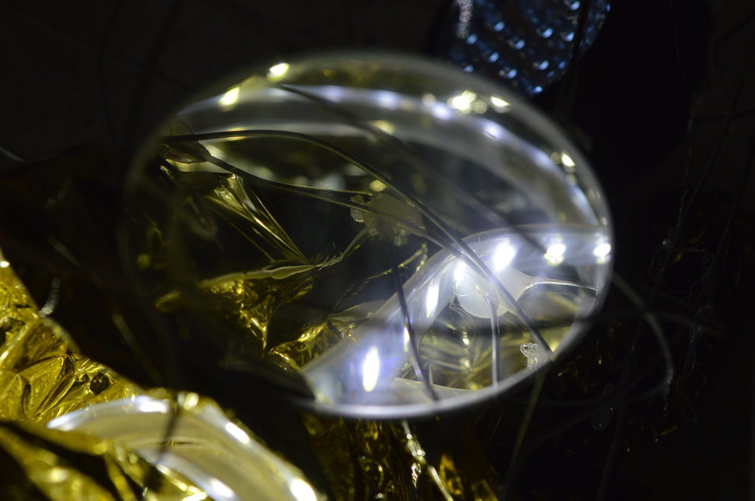
Inspired by the work of Lee Bull we had a practical lesson where we created a scene made of multiple objects.
I created 3 different setups and photographed them multiple times from different angles with varying light intensity and colours. This helped create many varying shadows, reflections and textures. I took distant and close up photos using the zoom. I also created different light intensities with studio equipment such as spotlights. I bounced the light off of the walls and ceiling to create a more soft light rather than direct.
Like Bul I used similar materials such as wire, string, lights, mirrors and foil. I tried to use the reflections of the lights to create varying perspectives of depth and fragmented images. I used different solid human objects such as heads and gloves similarly to Lee Buls use of limbs. Different compositions were achieved by taking photographs from different view points and distances.


Top 3 Photos as Enlargements
|
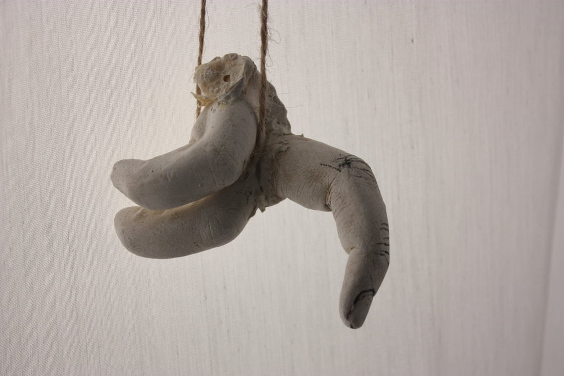
My favourite image is the one to the right. This is because it is a close up of stuffed fabric wrapped in strings that looks like a fist bound by ropes. The stuffed fabric has a texture that almost looks like skin on the fingers of a hand. This is similar to some of Lee Buls works as she uses stuffed fabric that almost looks like limbs with a fleshy colour similar to mine. This gives an idea of hands breaking free and no longer being oppressed which may link to Lee Buls views as a feminist. There is almost a sharp change in tone between the foreground and the background and the main focus is the fabric at the front as the background is slightly blurred due to depth of field. The studio equipment such as lights helped me achieve this. I controlled it so it wasn't too bright. This has helped me develop the idea that there is more meaning behind Lee Buls creations then it seems at first. |

|

Additional Artists - moving forward with my investigation into "materiality"

Rebecca Warren
This is similar to Lee Bul as the form and shape of the sculpture looks human like. It has a lot of empty space around it so nothing detracts from it. This is very similar to the way Lee Bul hangs here objects. It also uses a material that has a strong and hard texture that gives great contrast in tone. 
Graham Caldwell
This work links to Lee Buls use of reflections, mirrors and sharp metallic objects. The mirrors give a constantly varying image to the viewer as their position changes. Every person will see a different perspective and viewpoint. The composition is similar to Lee Bul as it is all randomly placed. |

Annette Messager I chose this because the objects in the work are distorted and hanging just like in some of Lee Buls works. The objects look like body parts such as arms, legs and bones which is also the same in Buls work. This and Lee Buls work also used stuffed fabric with a fleshy pink colour or red. |
Annette Messager Formal Image Analysis
The work is from an exhibition called motion/emotion and this gives the idea that there is a deeper meaning. The title of the work is "Penetration" The title is very simple while the work its self is more complex and made out of multiple different forms that aren't very clear at first. The work appears to be still but is actually in motion caused by viewers passing by. It is a very conceptual work of art because you can interpret it however you want. The subject matter is not very obvious however it looks as if it invokes a feeling of death and mutilation. The concept of the work is simple as it is just a series of hanging objects but the meaning behind it is hard to work out.
In the photograph there are multiple suspended objects that appear to be body parts hanging in a empty room. It looks as if there has been multiple bodies torn apart and hung by ropes. There is no focus point as all the suspended objects are hung all around the room and it seems that they are all of equal importance. There is nothing that exactly catches your eye at first. It is not framed.
The work makes me feel slightly disturbed and concerned for why the artist had made this grotesque display. It makes me question why the artist decided to create this piece of work and what drove her to do it. It looks a bit like a butchers shop with meat hanging up. Since there is no framing it gives the feeling of disorientation and it can be viewed from any angle. I don't think the work challenges me or my perception.
If I were to recreate this photograph I would use a wide angle lens and stand at the far end of the room and take the photo looking diagonally across with the camera level to get the entire subject matter in the frame. I would take the photo from a distance and keep everything in focus including the background by using a high depth of field. This would probably involve a slow shutter speed and I would have to use some support equipment like a tripod. I think the image is staged to have all the suspended objects at different heights and positions. I would use artificial light such as directional lights pointing towards the object. This will create shadows, contrast and with it a 3-dimensional effect. Many individual items with different sizes, shapes and colours go into this instillation.
Messagers works shows a detailed interest in humanity and its fragile, emotional core. Separating out individual organs and body parts reduces the whole body to a series of parts that can be seen individually rather than being together and concealed within the human form.
This connects to my work as I also used similar materials such as fabric and I also suspended objects much like her. The variation of colours used in the her work interest as they aren't the usual fleshy colours. In my future works I could experiment and investigate the use of artificial light and also obtaining different effects buy using varying depths of field.
"Animal, human, monstrous or something in-between, her creations suggest the complexity of life as well as the mythologies, superstitions and vanities that underpin it" (Museum of Contemporary Art Australia)
Practical Lesson
In this practical lesson I bought in some objects that linked to my studied photographers, Lee Bul and Annette Messager. The stuffed fabric are similar materials to what both of them used. I also used body parts such as fingers and suspended them in the same style.


|
This image is centrally composed with the finger vertical and pointing down to reveal the texture and finger nail to make it identifiable showing my link to Annette Messager and her use of body parts. I have also included other hand parts behind the subject matter to reduce the amount of blank background. I used a directional light with a diffuser at a side angle to give the objects a 3-Dimensional appearance as shadows are cast. I have used a low aperture for a shallow depth of field making the background out of focus the subject matter in focus.
|
|
The object in this photograph is central making it the main focus. There is no background noise to interfere with it. The viewpoint from where I was taking the photo was lower down, looking up giving it more tone and contrast. Even the the background is fairly unfocused, you can still see the texture of the sheet behind it. Linking to Lee Bul and Annette Messager I used rope to suspend the fingers giving it a more grotesque feel. |
|
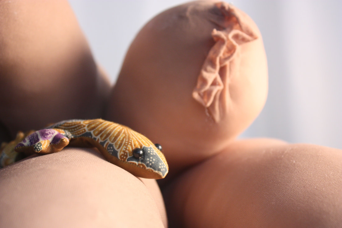
Here I have demonstrated a different way of composition. Here I have composed the subject matter in the bottom left corner. I also used stuffed fabric that was compressed to make it more solid and prominent. This lead to the creation of much darker tones and contrast from where the light is shined. There is also a variable focus with the lizard being very clear and as the objects are further back they become less clear in focus. Contrast is also created within the reflection of the black, beady eyes. The light source for this is from the right hand side but higher up and looking down. |
|
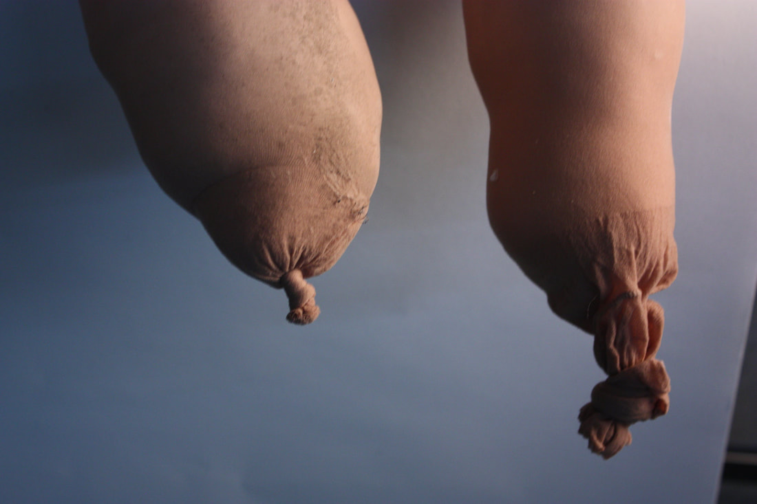
For this final chosen photo the objects are also suspended and dangling from an unseen position beyond the frame. The two objects are suspended at different heights making them different and more interesting. The shadows casted on the objects are stronger but not overpowering and too harsh. I have used side lighting to create this. |
The Formal Elements
The Formal Elements are the parts used to make up a piece of art.
|
The 6 formal elements are:
Line Shape Form and tone Pattern Texture Colour |
The 6 principles of design are:
Balance Contrast Movement Emphasis Proportion Utility |
The Formal Elements are important because they make up a photograph and without all of them photograph would be incomplete. Some times the photograph will have a larger emphasis on one of the elements. If we didn't have the formal elements we couldn't analyse and review a photograph or artwork.
Texture and pattern in response to Lee Bul
In photography a pattern is made up of repeated shapes or colours. They can be either random or regular.
Texture is what an object looks like on the surface. Texture can be either hard, soft, smooth or rough. Texture is what will normal reflect the light.
Texture can be emphasised according to the angle that light falls on it. Side lighting is preferable as it creates shadows and contrast.
Patterns and textures can be used as a main subject of a photograph or can form the background with the main subject in front.
Different textures and patterns can be found Lee Buls exhibits. Texture can be found on the different materials used such as fabric and pattern can be created through the reflection of the mirrors and foil.
To explore Lee Buls use of texture and pattern I went outside and I adjusted my camera to have a low aperture. This meant that the object i was taking a picture of would stay in focus while the background out of focus. I went around taking pictures of different surfaces and textures such as the tree bark, feather and leaves. To get these photos I needed to get low down and close to the subject matter.
Aperture

The Aperture is essentially the hole that lets light into the camera. It is measured in F-stop (large aperture f/1.4) (small aperture f/16). The larger the aperture the more narrow the depth of field is.
I used a side on camera angle when I took these photos as it
can create a pattern in the texture shown in the photo along
the wall. This leads to larger contrast in tone.
I used a side on camera angle when I took these photos as it
can create a pattern in the texture shown in the photo along
the wall. This leads to larger contrast in tone.


|

|
Macro Photography
Macro photography is when you take photos that are extreme close-ups of objects. It is usually photos of small objects or organisms that make them appear larger highlighting the details and textures on them however the depth field is narrow so everything else in the photo is blurred apart from the subject. With macro photography you can see small details that you may not notice with the human eye. Special lenses such as macro lenses and settings are used to achieve this.


Studio Photography
Artificial Lighting
Rembrandt
Rembrandt is a lighting technique that's used in studio portrait photography. They key In this lighting technique is to create the triangle shape underneath one of the eyes. The triangle shouldn't be longer than the nose and no wider than the eye. Sometimes a reflector can be used in Rembrandt Lighting to assist in showing the triangle. This technique is popular because it can produce images that feel both natural and compelling. It doesn't require much equipment and you can do it with one light.


Side Lighting
Side Lighting is when the key light is placed to the side, facing the subject matters face. This causes half of the face to be lit and the other half to be in. It can be pointed at the left or right side of the face. Having half of the face in a shadow creates a sense of duality. This lighting can help convey she subject matters shape and form. Side Lighting create the strongest representation of the subject 3-dimensional shape. Side Lightings man focus is contrast.


Butterfly Lighting
Butterfly lighting is when the key light is placed above and directly centred pointing at the subjects face. It is called this because it creates a shadow under the nose that represents a butterfly. It enhances the 3-dimensional shape of the subjects face giving a soft texture making it commonly used in glamour.


Myra Green
Artist Analysis
|
Myra Greene is an American artist who has worked on plenty of projects of which are mostly photographic.
The title of this work is "Character Recognition". Greene uses this work to investigate the construction of racial identity. She draws the viewers attention to the difference that there are between the same body parts of different races. This title helps me understand the work more as it suggests she is revealing and exposing features on her face that wouldn't be seen without the harsh studio lighting at close proximity. The title also gives the clue that it is about her racial identity and her differences. She could be trying to show herself as more than all the stereotypes that go around. I don't think this work is very conceptual. I think it is fairly easy to work out what Myra Greene is trying to portray. I think she is trying to draw special attention to the hidden textures and features on her face to reveal her true visual identity. This has been achieved as Greene exaggerates her imperfections on her face such as her pores and crinkles. With these photos she is embracing who she is and her natural beauty. The many photographs she took for this are all close ups of her face and features on it. She took them at face on and side on angles. The subject matters are very obvious in the photographs however the focus is never fully central. This could express the idea that nothing is perfect as the focus is never perfectly centred. The subject matters are enhanced with the use of lighting and how it shines on the surface of her face. For example in one of her photos the light is shining on her mouth revealing the wrinkles and cracks on her lips. You can see that her mouth is the obvious subject matter. Greene used the wet-plate collodion process to create this piece of work. This is a 19th century photographic method which was used during the times of slavery and the ethnographic classification. The image is staged with a strong artificial light focused on the parts of the face . The photographer is right in front of the camera taking pictures of herself up close and personal creating a dramatic final image as the unseen textures of her face are revealed. The work makes me feel curious to see how other textures would look. This is because of the great contrast in tone that highlights the texture and the lighting and uneven framing makes me feel this. I think Greene has challenged my perceptions because the use of the wet-plate collodion process suggests she is trying to link back to her races past such as slavery. This piece of work makes me question why she would want to portray herself in this way in small detail instead of the whole form. Greene's work connects to our overall theme as we are studying the formal elements such as texture, pattern, form and tone as well as the use of artificial lighting. Her work is also very close up and this connects with our macro photography photos. When I experiment and take photos in the style of Greene's "Character Recognition" I hope to develop skills while taking photos close up such as getting the right settings and focus. |


|
"Greene uses a diverse photographic practice to explore representation on race." (Myra Greene website)
Myra Green Practical Response
Further to my research on Myra Greene I have experimented her techniques at home.
When I was taking the photographs I tried to avoid including the whole head. Instead I tried to focus on certain parts such as the nose, mouth and ear.
When managing the artificial light I made sure that it was bright enough to expose the texture. I also used the light at many different angles to create a variety of tone and contrast within the photos and to make sure it didn't look flat.
I was using Greene's focus on hidden textures as inspiration however my framing is different and I have included more features with in each photo.


Edited Myra Green Photos
In this lesson I used photoshop to expose the hidden textures and features of the face in inspiration to Myra Greene. I made them black and white and attempted to highlight the white colours using the burn and dodge tools so they resemble the wet-plate collodion process that Greene used.


To make my photos more in the style of Myra Greene I used Photoshop. I used different techniques and tools such as black and white, levels, burn and dodge. I have chosen this as my best photograph because it shows a very great range of tones and contrast. Half of the face is black and his demonstrates my use of side lighting. I also chose this because I believe that it reflects Myra Greene the most. The whole face is not pictured in the frame and the texture is very successfully made obvious and is clearly one of the main focuses just like Greene.
Line and Shape
Line and shape are 2 of the formal elements. Lines usually draw the eye to a certain point. They can be vertical, horizontal or diagonal. They can also be curved and of any thickness. Shape is the area enclosed by a line. Shape and lines can be used to help compose the image.
Simon Phipps
|
Simon Phipps is a photographer who works in England. He is well known for his approach of Architectural Brutalism. His approach and execution of this is very unique. Phipps made it clear that his intentions are to document and show post 1945 British modern architecture. The works I am looking into were screen printed onto aluminium and this further suggests the idea of modern architecture and how the style of the architecture was all about materials. Phipps uses different camera angles that gives emphasis on the lines and shape of the buildings. He often takes them from lower angles making the buildings tower over him.
|


|

|
Line and Shape Photos
In this lesson I was studying Line and Shape and we looked at Simon Phipps as inspiration. Similarly to Simon Phipps I used buildings to demonstrate this. Many of the photos were from a lower angle looking up at the building just like Phipps to create a variation of lines as they turn out diagonal. I also composed some of the images with the lines lined up with the frame. Simon Phipps took pictures of buildings that are post 1940 architecture and I felt some of the school buildings were very similar. I avoided taking straight on photos of the buildings and took them with the camera aimed at the edge creating diagonal lines and more complex shapes within them.


Edited Line and Shape Photos
For this task I used photoshop to edit some of my chosen best photos to make them look like Simon Phipps. I used black and white, levels, burn and dodge tool to achieve this. I aimed to highlight the texture in most of the photos with inspiration from Myra Greene.


|

|
I have chosen this as my best photograph as I have used a variety of vertical, horizontal and diagonal lines and made them line up with the border of the photograph. I also deliberately composed the larger, bold line diagonally through the centre drawing the viewers eye to it making it the main focus. The texture is also very noticeable in the photograph and it is a close up. This links to my previous studies on Myra Greene as she focuses on the texture of her face. This also links to Simon Phipps as he a lot of his photographs are of urban areas and buildings and he also uses line and shape which was the focus of this photo. I believe that the use of black and white and levels in photoshop have helped make this image successful because I have been able to manipulate the contrast in colours to make the texture stand out more as well as the lines.
Layered Landscapes
Layered Landscape is when you layer different photos of a landscape over each other creating one image in any way you want to. Some artists such as Michael Wesley use layered landscapes to show the change over a period time. I will use Photoshop to layer my different photos and use similar and new tools to create edits.
Michael Wesely
|
Michael Wesely is a German photographer best known for his extremely long exposure technique. He has taken photos of different urban landscapes including cities and buildings. Wesely is also known for his still life photos of flowers using his long exposure technique. Wesely makes the long exposure photos with a pinhole camera that he sets up with a tripod and keeps it in the same position for over a year. Each photo over the time are layered with different opacity's.
|


|

|
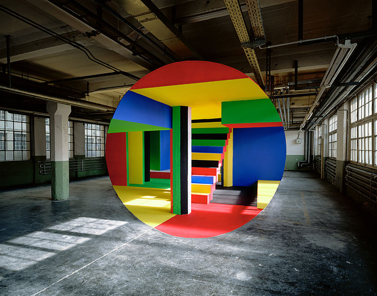
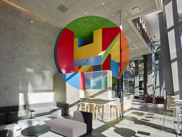
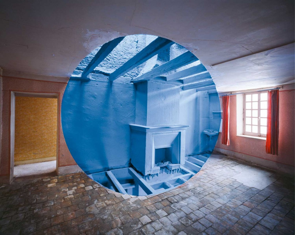
Georges RousseRousse goes to abandoned and derelict buildings and places to create his installations. He does this because he wants to make them pictorial places that viewers can interact with. He paints objects, walls, roof and floors so that from a certain perspective a circle is made out of the multiple colours. Multiple different shapes and lines are created within the circle due to the use of clashing colours. The main focal point is found within the circle.
It is a photograph of a abandoned derelict empty building. The instillation contrasts from the space around it as it is made of very vibrant primary colours and the space around it is dull and colourless. The circle shape is framed in the centre of the photograph making it the obvious main focus. It is not very obvious of what it is because I thought it was a edited filter the first time I saw it but with closer examination and research I found out it is a separate piece of work. This work gives me a positive feeling as it is the revival of a lost and useless building. This is due to the vibrant colours and it giving a reason to visit the building. The main question this raises in my mind is how Rousse makes the work to be an almost perfect circle. If I were to recreate this I would consider the composition and framing of the photograph. I would need to make whats in the circle the focus of the photograph and make it contrast with whats outside the circle. I could do this in Photoshop by using a solid colour layer to make whats in the circle contrast. I could experiment with different images inside the circle. I could also use different shapes. This links to my work as I have been experimenting with the formal elements, especially line and shape because these are demonstrated clearly in Rousse's works. |
|
Layered Landscape Photos
For this task I created a walk around my local area. Along this walk I took photos of different nature and urban landscapes to demonstrate my use of the formal elements Line and shape. I was trying to develop and highlight the difference between the more natural elements of the nature areas and Alexandra Palace. A contrast of soft natural shapes and hard rigid man made items of building and architecture similar to Simon Phipps. The natural areas are informal and random while the buildings are formal and feature repetitive elements. I chose to take pictures broken walls at Alexandra Palace as I found that it was similar to the abandoned buildings Rousse visits to create his pieces of work due to the brick being old and worn out by weathering. I also took pictures from a low angle looking up to the buildings similar to how Simon Phipps does. I took many pictures of brick work as they contain strong vertical and horizontal lines and have texture
I experimented with different aperture settings to get varying depths of field In some photos to define sharp of the main object and blurred backgrounds. At the time it was raining and I decided to do the photo shoot in this weather as I felt that it would be different and more interesting. The reflections off of the dampness of surfaces created a bigger difference in contrast.
I experimented with different aperture settings to get varying depths of field In some photos to define sharp of the main object and blurred backgrounds. At the time it was raining and I decided to do the photo shoot in this weather as I felt that it would be different and more interesting. The reflections off of the dampness of surfaces created a bigger difference in contrast.


Edited Photos in the style of Georges Rousse


My intentions while taking this photograph was to demonstrate the use of line and shape in inspiration of Simon Phipps. I aimed to show a variety of uses of line and shape in each photograph and I think it has been successful in this chosen one. I have deliberately taken the photo from this angle to make the vertical lines curve around the corner of the wall making them seem diagonal creating variety. this also links with Myra Greene as the photograph also demonstrates uses of the formal elements texture and pattern. This is similar to Simon Phipps as the images have high contrast with the utilisation of both texture and contrast. The photograph is also of an urban environment and features hard architectural surfaces similar to Simon Phipps. I think I was able to show similar techniques to Simon Phipps it is of a building. The Photoshop was made in inspiration of Georges Rousse and how he uses circular shapes to change an area.
